The brightest person in the room might also be the worst one at telling a story.
In the early years of in-home energy display technology, there was an ongoing and often heated debate over how to drive behavior change among energy consumers: either talk about money or talk about comfort, but not both.
The industry grappled with how to introduce in-home information displays, what they should say, what they should do, and how long it would take for the devices to be shoved in a kitchen drawer (we called this MTKD; or mean time to kitchen drawer). Conference tracks and gallons of virtual ink were spilled by product managers, consultants, designers, and engineers as little consensus emerged for how best to tell customers that they could save a few bucks on their monthly bill without being too cold or too hot.
I remember the day that the 2011 Nest project broke the code wide open. It was just a thermostat; but it was beautiful, smart, and using just a few data points could program itself. And most especially, it enrolled customers in revolutionary change—Nest was on a mission to save home energy and we were invited along. The thermostat didn’t even have a clock, but it “learned,” kept the customer comfortable, and often saved money.
Most of the product managers in the smart thermostat space thought that customers wanted choice and control, but what they really wanted was for someone to manage their incomprehensible programmable thermostats.
All of a sudden, thermostats were exciting, and it made its early adopters part of a revolution. Nest became a market maker, and they did it by being better at programming thermostats.
Some might be tempted to chalk this up to great marketing and a flashy hardware design, but that’s overly cynical. Nest told a story to customers about how they could change the world. And they sold them this vision, by offering them an opportunity to help make important change in exchange for a phone app, a round glowing thermostat, and a few bits of information about their home.
They took the focus off the details of money or comfort and created a narrative that didn’t require much more than a few hundred bucks and some wall space. And people loved it.
Context is King
In the case of the big data ecosystem, data consumers must be able to make sense of information. In the utility especially, they need the data to help them either make a business decision or maintain an appropriate situational understanding of the operating environment. Unfortunately, in the data-driven utility, poorly-designed and rendered graphical representations of enterprise information can create the wrong impression of the meaning of the data, leading to incorrect conclusions and poor decision-making.
The best way to transform big data and analytic opportunities and results into intelligence is by setting the context; maybe it’s an energy revolution, but more likely its complying with regulations, making good business decisions, or ensuring reliable service in a territory with large amounts of distributed renewable resources.
This is especially true in operational environments where the complexities and demands for near-real-time awareness is high; where the ability to understand advanced geospatial and visual models in an instant—the need for clarity and simplicity is high.
Context helps data consumers become aware of the terms of what they are trying to understand; it sets the stage for a decision point. It can be set through maps, multi-dimensional data visualization, or the proper use of color on a spreadsheet, but the state-of-affairs is understood.
Get to the Point
Data visualization can be hard, especially if there is a lot of varied data to present, but we all know messy and ineffective data presentations when we see them. Think about the story you want to tell.
Figure 1 is an example of how context can be incorporated directly into the data presentation. These are two representations of the same data, showing 1 utility worker out of 5 who is over the age of 55. The left shows workers in a row and the right is a proportional representation in a pie chart (I’ll admit it; I can’t even think of a good use for a pie chart unless it is actually describing dessert). The left rendering tells us right away, we are talking about people. The right tells us nothing until we read the legend and assess the colors.
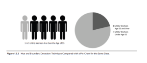
Figure 1. Unless You Are Making a Point About Apples, Avoid the Pie Chart. “Big Data Analytics Strategies for the Smart Grid” Stimmel, 2012
We don’t discuss data aesthetics often in this industry, but effective data presentation should have an element of simplicity and beauty. The effort of building data visualization requires many skills beyond the analytic and statistical. It requires conceptual thinkers, graphic designers, programmers, user-interface designers, and good storytellers. Don’t leave these thinkers out of your plans.
Let’s be honest; some big data vendors are tempted to include visualization with their products, although they sometimes seem to be doing their level best to avoid making good design choices. It’s not uncommon to see bizarre color combinations, distracting animations, and gratuitous graphics that increase the time and effort required to make sense of what’s being presented. In fact, the problem has gotten so far reaching across the modern world, that there is an entire website dedicated to bad visualizations.
While data scientists have an important role in designing powerful and accurate models for the utility, the ability to explore data and draw actionable conclusions is not always about laying every single data point out there.
Well-presented data helps utilities realize a return on their smart grid investments, and even drive down operating costs while increasing the ability to make good and timely decisions.