Data visualization software can help utilities visualize the return on smart grid investments and show how much change smart grid technologies bring.
Data visualization is the graphical representation of data and information using visual elements such as maps, charts, infographics, tables, dashboards, and graphs. To better understand and see data patterns, trends, and outliers, you need data visualization tools to provide this access to enhance operational efficiency. Therefore, it is essential to have data visualization technologies and tools when you work with numerous data. They can help you analyze a vast amount of data and aid in making data-driven conclusions.
On the other hand, a smart grid employs computer technology to enhance the connectivity, communication, and automation of the different parts of a power network. Below is how to use data visualization to realize the return on smart grid investments.
Geographical Visualization
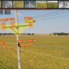
Data visualization software makes it possible to assess a geographical area and see the impact of smart grid investments. Platforms like GIS, Geographical Information Systems such as ArcGIS, Quantum GIS, Open Street, and Google Earth are used to show the system’s power flow. Data visualization shows what areas in a geographical setting are more vulnerable and have sufficient power flow.
A study shows how smart grid investments are leading to the urbanization of different countries. It also projects just how much more urbanized more places are going to be. Data visualization gives an overview of where smart grids are working and where they may need improvement.
Some data visualization techniques employed in geographical visualization to realize the return on smart grids include scatter plots, contouring maps, buffer analysis, place and map, animations, bar, line, and pie charts.
Efficiency
The employment of data visualization to realize the return on smart grid investments has been quite effective. It has shown just how efficient smart grids are, for instance, going by the indicators like load factor, availability index, less interruption, and customer satisfaction. It also shows how there are fewer outages and blackouts for people using smart grids.
Data visualization shows how much change smart grids are bringing and why there is a need to invest in that sector. The data is often processed in four phases: raw data, processed data, visual symbols, and visualization.
Multi-Variable Data
To best visualize the return on smart grid investments, it is essential to employ multi-variable data visualization, either in 2D or 3D. Some of the available solutions include advanced scatter plots, coordinated plots, and Andrew curves. The use of multi-variable data is to show the relationship between different variables and monitor the smart grids. It has proven to be quite useful, although each method has its perks and downsides.
Data visualization makes data easy to understand. As stated above, data visualization is very crucial in realizing the return on smart grid investments. Most, if not all, professional fields benefit from this technology. Fields such as finance, STEM, government, consumer goods, sports, education, marketing, and service industries benefit from data visualization. It is, therefore, vital for professionals to learn how to use data visualization. It is also crucial to invest in smart grids since a lot of data shows their advantages and potential.